

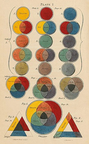
Color theory plays a crucial role in graphic design, influencing how audiences perceive and interact with visual content. Understanding the impact of color is essential for creating effective and visually appealing designs. Here are key aspects of the impact of color theory in graphic design:
1. Emotional Impact:
- Colors evoke emotions and can convey a wide range of feelings. For example, warm colors like red and orange may evoke excitement or passion, while cool colors like blue and green can create a sense of calmness or serenity. Graphic designers strategically use colors to connect with the intended emotions of the target audience.

2. Brand Identity:
- Colors are a fundamental element of brand identity. Consistent use of specific colors helps establish brand recognition and reinforces the brand’s personality. The chosen color palette should align with the brand’s values and resonate with its target audience.
3. Communication and Messaging:
- Colors play a role in communication and conveying messages. For instance, contrasting colors can highlight important information, while harmonious color schemes can create a sense of unity. Designers use color to guide the viewer’s attention and communicate hierarchy in design elements.
4. Cultural and Contextual Considerations:
- Different cultures associate colors with varied meanings. Graphic designers need to consider cultural and contextual factors when choosing colors to ensure that the design communicates appropriately across diverse audiences. A color that signifies celebration in one culture might represent mourning in another.
5. Readability and Accessibility:
- Color choices impact the readability of text and the overall accessibility of a design. Contrast between text and background is crucial to ensure legibility. Designers need to consider color combinations that are accessible to individuals with color vision deficiencies.
6. Attention and Focus:
- Colors can be used strategically to grab attention and guide focus. Vibrant or contrasting colors can draw the viewer’s eye to specific elements or calls to action. Designers use color to influence the visual hierarchy and create emphasis where needed.
7. Psychological Associations:
- Colors often have psychological associations that designers leverage to convey specific messages. For example, green may be associated with nature and health, while black can convey sophistication or mystery. Understanding these associations helps designers craft visuals that resonate with the desired psychological responses.
8. Consistency and Coherence:
- Maintaining consistency in color choices across various design elements creates a cohesive and unified visual experience. Consistent use of colors reinforces the brand’s identity and ensures that the design elements work together harmoniously.
9. Call to Action (CTA):
- Colors can influence user behavior, particularly in the context of call-to-action buttons. Designers often use high-contrast or attention-grabbing colors for CTAs to encourage user interaction, such as clicking a button or making a purchase.
In summary, color theory is a powerful tool in graphic design, influencing the emotional impact, brand identity, communication, and overall aesthetics of visual content. Designers need to be intentional in their color choices, considering the psychological, cultural, and contextual factors to create compelling and effective designs.


