


Source: CapCut.Com
The world has gone video-crazy and for good reason! Video content has become an integral part of our daily lives, captivating audiences and driving engagement like never before. However, with an ever-growing array of devices and screen sizes, ensuring your videos look great on every platform can be a daunting challenge.
That’s where responsive video design comes in. By harnessing the power of the CapCut video resizer, you can effortlessly adapt your videos to fit any screen, delivering a seamless viewing experience for your audience. From mobile devices to desktop computers, responsive video design ensures that your content shines brightly, regardless of the device used.
In this article, we will explore the benefits, techniques, and tools behind responsive video design, empowering you to create versatile and impactful content.
The Significance of Responsive Video Design

Source: CapCut.Com
In a digitally connected world where smartphones and tablets have become ubiquitous, responsive video design has emerged as a crucial aspect of digital content creation. With the increasing diversity of devices and screen sizes, it’s essential to deliver videos that adapt seamlessly to different resolutions and orientations.
Responsive video design allows content creators to cater to the needs of their audience, regardless of their preferred viewing platform. By employing this approach, videos dynamically adjust to the screen size, providing an optimal viewing experience without sacrificing quality. Whether it’s a promotional video, tutorial, or entertainment content, responsive design ensures that the message is effectively communicated on any device.
Beyond improving user experience, responsive video design also enhances engagement and encourages sharing. When videos are tailored to fit various screen sizes, viewers are more likely to stay engaged and interact with the content, leading to higher retention rates and increased conversions.
Additionally, responsive videos make your content more accessible to a broader range of users, including those with disabilities or older devices. By considering the needs and preferences of all users, responsive video design promotes inclusivity and equality in the digital realm.
Utilizing a Video Resizer for Seamless Adaptation
Source: CapCut.Com
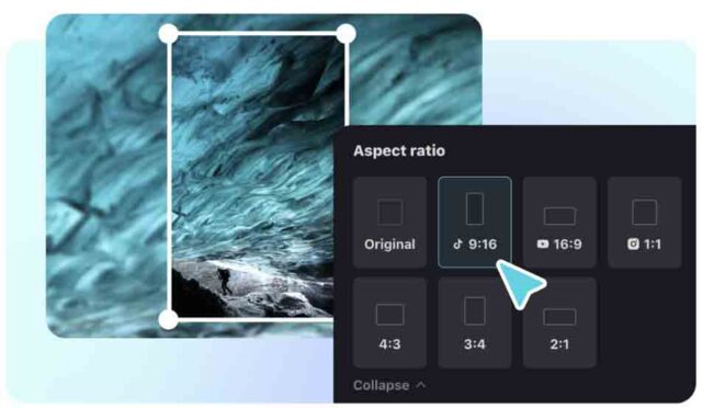
One of the key tools in a responsive video designer’s arsenal is a video resizer. A video resizer allows content creators to effortlessly adjust the dimensions of their videos to fit different screens without compromising on quality. CapCut, a popular free online video editor tool, provides an intuitive and user-friendly interface for resizing videos seamlessly.
With the CapCut video resizer, creators have access to a wide range of preconfigured aspect ratios and resolutions, ensuring that their videos look impeccable, regardless of the device they are viewed on. By simply selecting the desired aspect ratio and output format, videos can be easily adapted for various platforms, including social media, websites, and presentations.
The video resizer’s functionality goes beyond simple resizing. It allows for precise cropping, rotation, and scaling, ensuring that the focus of the video remains intact even after adaptation. This versatility enables content creators to maintain their intended visual storytelling across different screen sizes, creating a consistent and engaging experience for viewers.
By utilizing a video resizer, creators save valuable time and effort that would otherwise be spent manually adjusting videos for different devices. The convenience and efficiency offered by a video resizer streamline the process of responsive video design, enabling creators to focus on their content while still delivering a visually stunning experience to their audience.
Enhancing the User Experience with Responsive Videos

Source: CapCut.Com
When it comes to delivering an exceptional user experience, responsive video design plays a crucial role. By leveraging a video resizer, content creators can ensure that their videos are not only visually appealing but also accessible and easy to navigate on any device.
Responsive videos dynamically adjust to the screen size, eliminating the need for users to manually zoom or scroll to view the content. This seamless experience not only saves users’ time and effort but also keeps them engaged. Whether someone is watching a video on their smartphone during a commute or on a large desktop monitor at home, responsive video design ensures that the content fits perfectly within the available screen real estate.
Moreover, responsive videos make your content more inclusive, catering to individuals with different abilities and devices. By adapting to various screen sizes and resolutions, responsive video design enables a wider audience to enjoy the content without any visual or functional limitations. This inclusivity fosters a positive user experience and reflects a commitment to accessibility.
In addition, responsive video design allows for better readability of text overlays and captions, ensuring that all important information remains visible and legible regardless of screen size. It eliminates the frustration of having to strain one’s eyes or missing out on crucial details due to improper scaling.
Creating Eye-Catching Video Backgrounds
Source: CapCut.Com
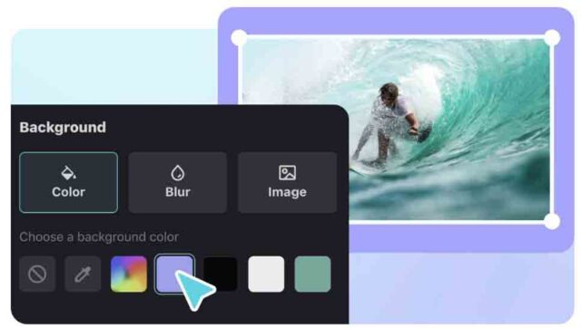
Video backgrounds have gained immense popularity in recent years as they add depth and visual interest to websites, presentations, and social media posts. With the CapCut, content creators can easily employ the video background remover feature to remove the background of a video and replace it with captivating visuals that resonate with their brand.
Video backgrounds offer a unique opportunity to make a memorable first impression and instantly grab viewers’ attention. Whether it’s a subtle loop, an animated design, or a dynamic scene, video backgrounds have the power to captivate and immerse the audience in the content.
By incorporating video backgrounds into responsive design strategies, content creators can enhance the visual appeal of their videos while maintaining a cohesive brand identity. These backgrounds can complement the main content, reinforce the message, and create a more engaging and immersive experience for viewers.
Conclusion
Video resizing ensures that the captivating visual experience remains intact regardless of how viewers access the content. Embrace the power of responsive video design to captivate your audience and stay ahead in the ever-evolving digital landscape.


